R & Python Tutorial: Get Your Bar Charts in Order
📊 Bar charts are one of the most common methods for displaying data. However, bar charts are not always created optimally. In this post, I’ll share R and Python code that you can use to create accurate, informative and attractive bar charts easily. Specifically, sorting your bars when your data have no natural ordering, which I’ll now explain.
When to use bar charts1
You can use bar charts when you have categorical data, which refers to data that can be categorised into distinct groups. Eye colour, ethnicity, gender, social class, school grades (e.g. A–F) are examples of categorical data.
Categorical data can be further divided into whether they have a natural order or not. Eye colour, ethnicity and gender are examples of categorical data that have no natural ordering. On the other hand, social class and school grades have natural ordering. Take school grades for example: an ‘A’ is better than a ‘B’, which is better than a ‘C’, and so on.
When categorical data have no natural ordering, they should be ordered by size (e.g. category occuring most often first, least often last) as this helps readers scan more information and spot patterns easier.
Order your bar charts easily in R and Python
I will use the US cereal dataset to reproduce some charts from an earlier blogpost on creating effective charts for a business audience that I wrote with my colleague, Rachael Dottle.
I will first create a bar chart with default options, which automatically orders the categories alphabetically, then a bar chart ordered by size, where the bars are arranged in a descending order. A simple tweak in ONE line of code in both R and Python will produce a more attractive and informative chart.
In the code examples below, the data set will be called cereal. The bar chart will have the cereal brand on the horizontal axis and the calories per serving on the vertical axis (termed brand and calories respectively in the code examples below).
R (using ggplot2)
library(ggplot2) #the library you need
ggplot(data = cereal,
       aes(x = brand, y = calories)) +
geom_bar(stat='identity') 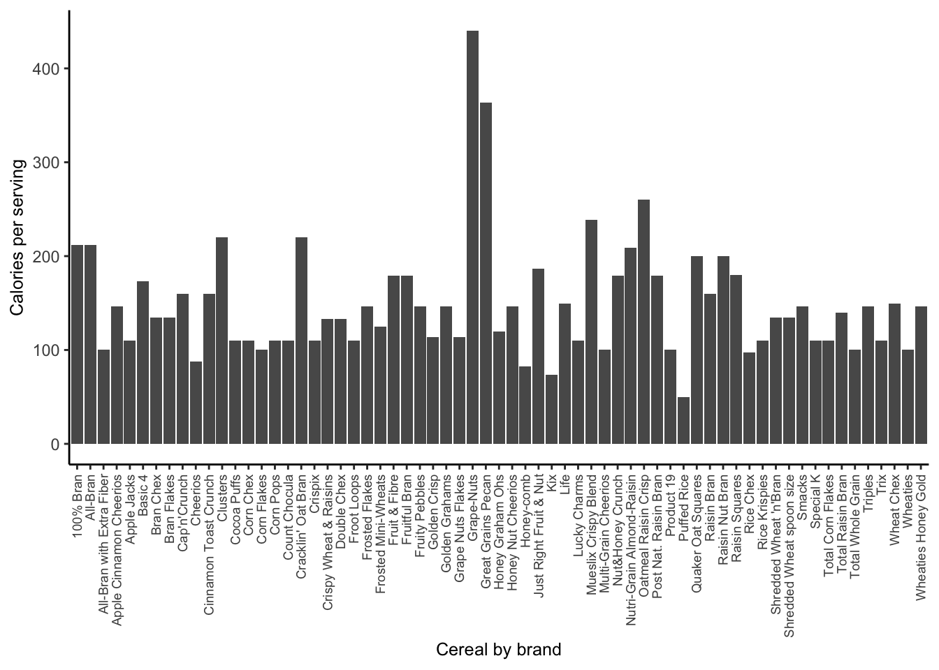
ggplot(data = cereal,
       aes(x = reorder(brand, -calories), y = calories)) +
geom_bar(stat='identity') 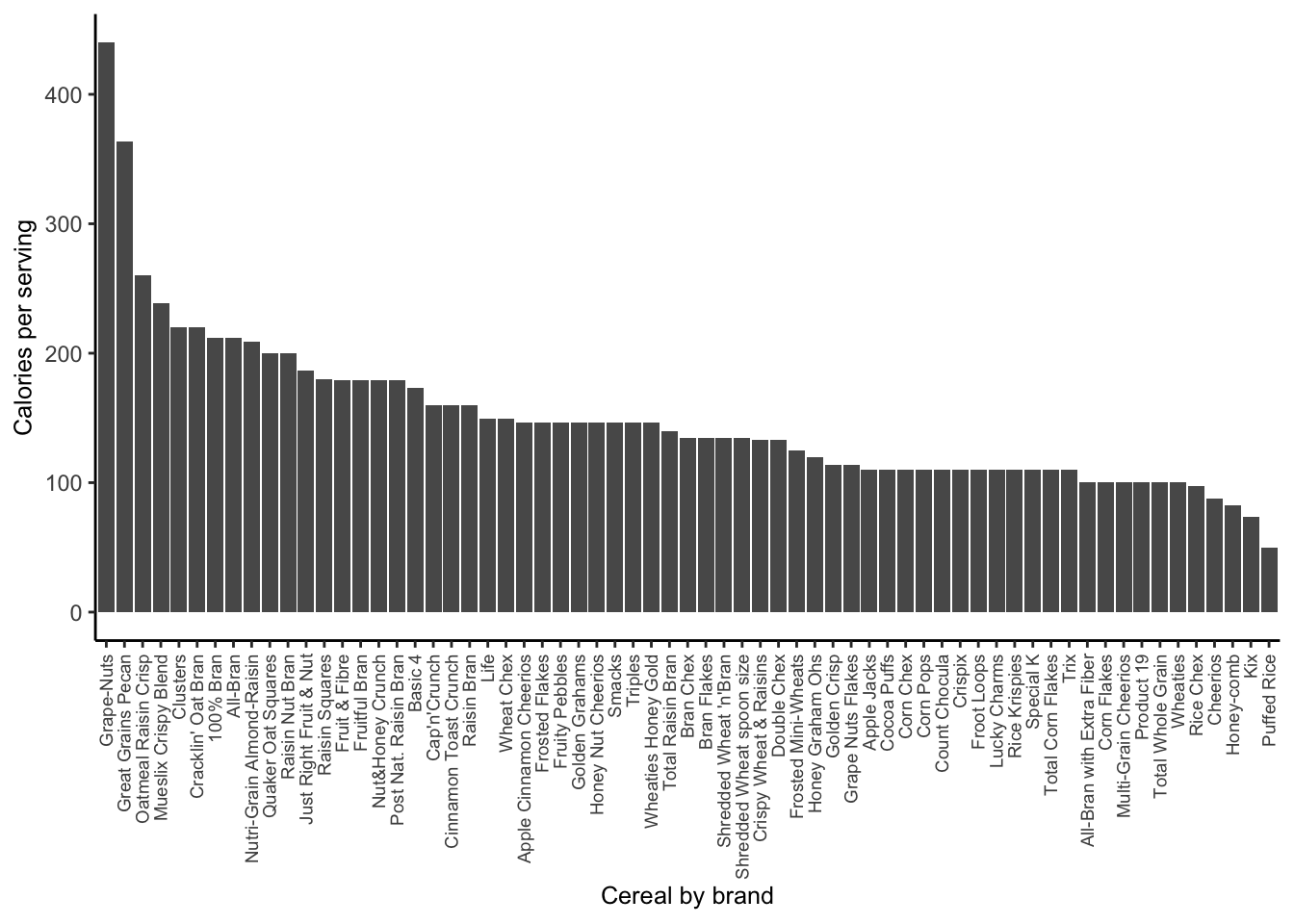
What changed?
In the second line of ggplot, x = brand changed to x = reorder(brand, -calories).
Python (using seaborn)
import seaborn as sns  #the library you need
sns.barplot(x = 'brand', y = 'calories', color='gray',
            data = cereal)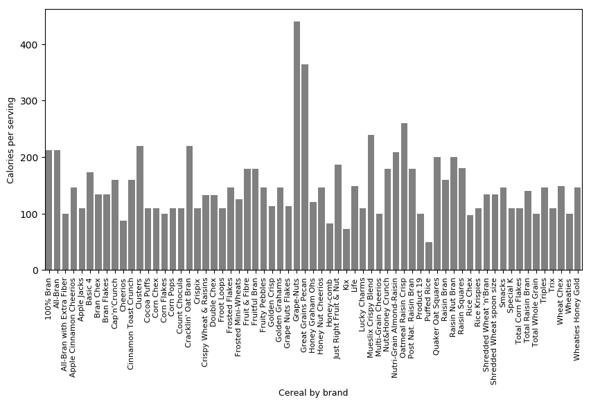
sns.barplot(x = 'brand', y = 'calories', color='gray',
            data = cereal.sort_values('calories', ascending=False))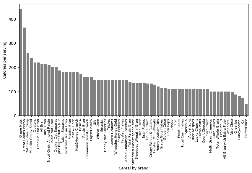
What changed?
In the second line of sns.barplot, data = cereal changed to data = cereal.sort_values('calories', ascending=False).
Summary
It is good practice to arrange your bar chart by how often the categories appear in your data—if the categories have no natural order, e.g. eye colour, gender. The examples above show how this can be done easily in R and Python by tweaking ONE line of code.
For this section, I’ve adapted information from a highly-recommended book: Freeman, J. V., Walters, S. J., Campbell, M. J. 2008. How to display data, British Medical Journal Books.↩