How to Display Data in the Business World
This is a special post co-authored with my colleague, Rachael Dottle who is a Data Visualization Specialist with the IBM Data Science Elite team. We share simple tips to produce charts that are accurate, meaningful and attractive for a business audience.
Businesses are becoming more data-savvy and relying on insights from data to make more informed decisions. However, big data presents big challenges: data do not speak for themselves and can be difficult to understand. How can we summarize the data into something that is accurate, meaningful and attractive?
Producing a chart is a powerful way of conveying what the data are saying. But, producing a clear, meaningful and attractive chart is not as easy as it seems. Just do a quick internet search of ‘Chart junk’ or recall all the times you felt frustrated trying to understand a chart or even numbers in a report or presentation.
In this post, we’ll share some of the best practices for displaying data from high-stakes medical research1 and tailor them for the business world. Like executives, doctors and healthcare professionals are time-pressed and want well-displayed data to extract information correctly in the shortest possible time.
Let’s jump straight to a simple example before we share some principles of visualizing data!
Imagine you’ve been asked to analyze the nutritional value of different cereals and share your findings. You are unable to get more clarity or guidance for now. So, you take a look at the data and decide to focus on exploring the calorie content of the 65 different cereals2.
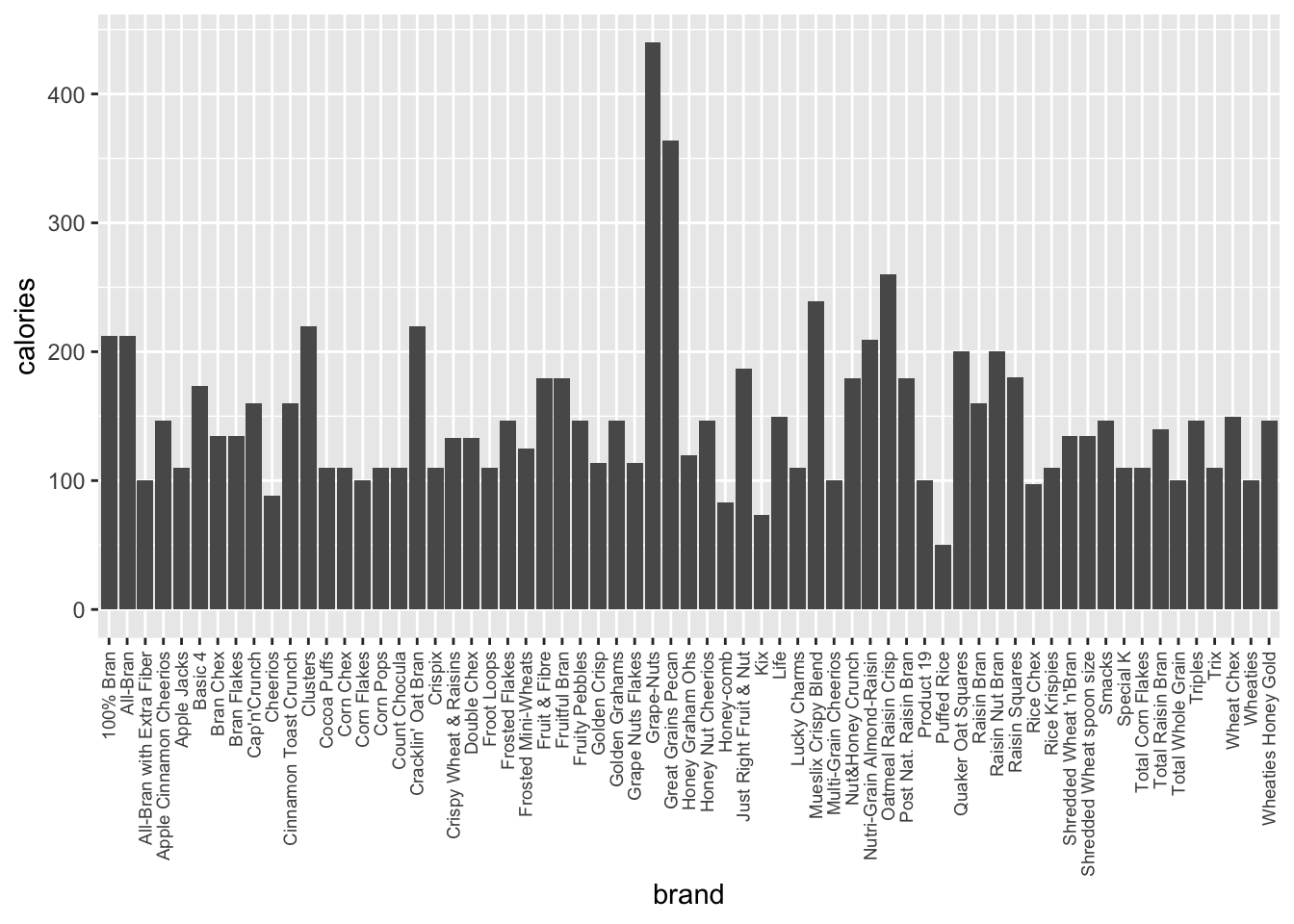
Default bar chart
You produce a bar chart with the default settings from R’s ggplot2 library and it looks like this.
Or, like this if you used the default settings from Python’s seaborn library.
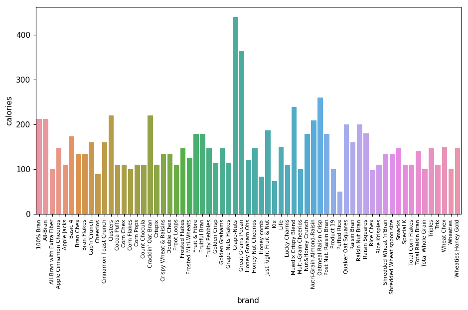
With some effort, you can see that Grape-Nuts and Great Grains Pecan cereals have the most calories. However, the default chart is messy, unappealing and not very informative:
It is not clear how to compare these two cereals with other cereals.
The different colours are distracting.
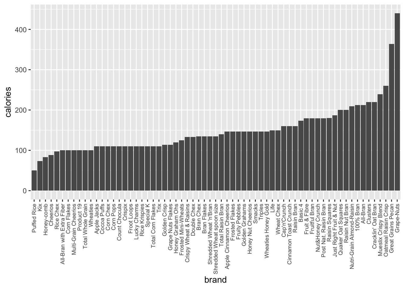
You can improve the chart with one simple tweak by ordering the cereals by calorie values as there is no natural ordering to the cereals. This helps the eye scan more information quickly.
Ordered bar chart
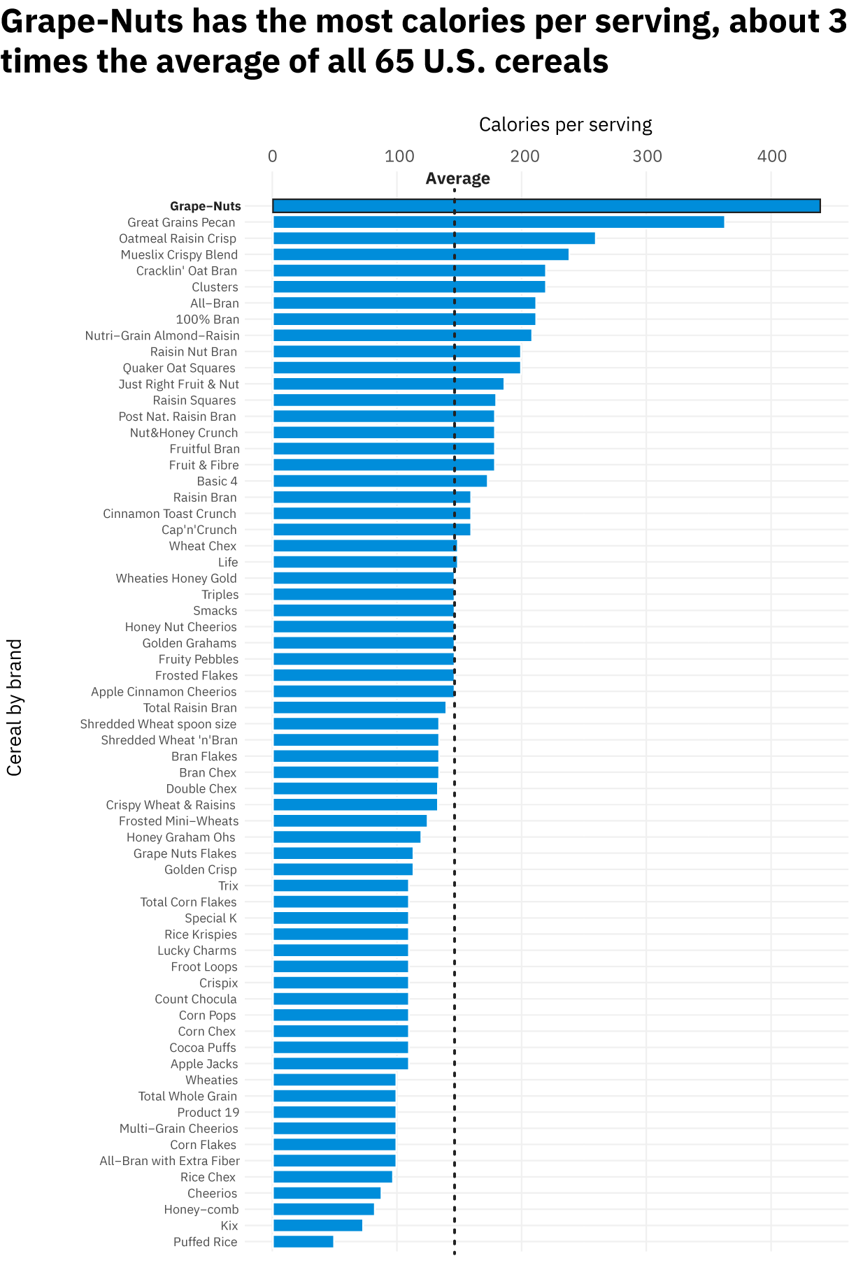
Improved ordered bar chart
You can make some further tweaks before sharing this chart with your business colleagues. It is helpful to remember: the more specific you are, the better. Make sure your chart clearly reflects the takeaway message you want your audience to understand, in this case the discovery that Grape-Nuts cereal has almost three times the average calories per serving.
These are some best practices that can improve your chart:
Add a short, helpful title. Most people don’t enjoy reading long notes or complicated legend titles, and they may end up misunderstanding the content of your chart if you aren’t making it explicit.
Make your axis labels human-readable. Default axis labels often end up just showing the data column’s name, which might not tell your viewers what the data actually mean, what units you’re using, and any other relevant information.
Consider adding a highlight or annotation. What is your main takeaway? Is it in your title? If so, is it something you want to direct your viewer’s eye to? In a bar chart, that might mean giving a darker shade of your chosen colour to the bar you want people to notice, or adding an outline and note.
Think about what you’re leaving out. Every chart is made through a series of choices: which columns are you going to choose to show? Which are you deciding not to show? Are you adding any filters or adjustments to your dataset to simplify your visualisation?
For example, you may decide including every cereal in your data is too much, since your takeaway is only about the highest calorie ones. So, you might decide to show only the top 10 cereals. This might be the right choice for one audience, but it may not be enough information for others, especially if your audience is interested in knowing the highest calorie cereals, but also wants to know the lowest calorie ones, and how many you’re comparing overall.
Making sure you know what choices have been made helps you to make visual decisions that explain and demonstrate those choices. Every chart has a perspective, and knowing yours helps you to contextualize it and makes sure you are not subconsciously misleading your viewers or reaching conclusions without knowing the full story.
Summary
A clear, meaningful and attractive chart can communicate your message effectively, but can be challenging to create. In this post, we provided simple tips with explanations and examples to demonstrate how you can make better charts easily. These tips are summarized below.
Always ask yourself these 3 questions when you want to display your data:
What do you want to show?
What are the available methods to do so? Pick the best method.
- There are hundreds of resources that can help you decide, including:
Can it be improved? If yes, refine.
Eight simple tips to improve your charts
Keep your chart clear and concise by maximizing the amount of information for the minimum amount of ink.
Summarize your main message in the title.
Use colour and patterns critically as they can distract your message.
Clearly label axes with units if needed.
Keep grid / solid lines to a minimum and in a lighter color (light grey if using a white background for example).
When variables have no natural ordering, order them by size.
Keep vertical scale for bar charts as the height of the bars are only accurate when the axes start from zero.
If needed, include the source of your data so your chart can stand on its own in a presentation or report.